Sunday, October 24, 2010

Project 3 Analysis Maps


Model choice is the Steiner Store because of the amount of sales is greater and the area income is higher then the Bosworth store.


This map is showing the Available Properties and the one mile radius around the sites.

Monday, September 20, 2010

Tuesday, July 13, 2010

Tuesday, April 27, 2010

The proportional part of this map represents the percent of participation in the ACT tests across the US using unstandardized data. The test average score is represented in a choropleth unstandardized color form across the US with the subjects Math and Reading.

Tuesday, April 6, 2010

Week 11 Google Earth Lab


Trying to decide where the best place to place a wind turbine farm was quit hard. I don't know if I picked the best place but it seems the best for the moment. I chose to put the wind farm out in the Great Lakes because of several reasons. Some are the reasons consist of the general public and the effects of the visual of the wind turbines. Even I would not want to see them in my visual area where I live. There are in fact some parks in the area but I chose to put the farm far enough out that it is not much of a concern to nearby campers and tourist. The affects on wildlife is also not affected. Birds migrating in the area as well would not effect them. Shadows and sounds would not effect the population either. There is enough wind speed year round in this area to produce enough energy to be sufficient to work properly. Winds to high might effect in the long run and cause more maintenance to the turbines. Therefore my selection for the farm would be a great area to conserve energy in the greenest and safest ways known to man.
I watched a show on the History channel about the effects of wind turbines and how it would be over time after the life of people. The show is called Life After People. I don't remember the episode name but it was a few months ago. How ironic we are doing an assignment on Wind Turbines. As I looked up the shows name I noticed that a show on How the Earth was made and it was about the Great Lakes. How weard is that. Here is an address if anyone is interested in watching it. http://www.history.com/shows/how-the-earth-was-made

Monday, March 29, 2010

Week 10 Isarithmic Map


This assignment was done using Isarithmic Mapping. The first thing I had trouble with is drawing the lines so I erased all that I did and started over. I then made sub-layers to put my different values in so that I could then turn off the ones I was not drawing the contours for and I could see the area better. That is the only problem that I had.

Wednesday, March 24, 2010

Week 9 Immigration Flow Maps


This map was a little challenging at first but once I got going with it I had fun with it. I liked the pencil tool the best. It was much easier drawing.

Tuesday, March 23, 2010

Tuesday, March 16, 2010


This assignment took longer then I thought it would.

Sunday, March 7, 2010

Week 7 Proportional Symbol Mapping


This map was created for the use of a proportionate symbol map of wine consumption in Europe year 2005.

Tuesday, February 23, 2010

Week 6 Choropleth Maps


In this assignment I worked with making Choropleth Maps. My first map in which you see above is the percentage change in population by state. This map I found it very easy to put together. I did not have much trouble at all.


In my second map I had to calculate the percentage change in population by divisions. I am not sure I had did this correctly by seeing other students maps but I am going with it. I put it together to my understanding of the assignment. If there is something I did wrong then please feel free to let me know. This is how I understood the assignment. I did not get to post the second map last night because right after I posted the first one my internet crashed and so did cable and it did not come back on. That was at 1 am Wed morning. I guess cable had an issue and lost there signal so I went to bed and did not get to finish my second map till now.

Wednesday, February 17, 2010


Wow what a challenge this one was. I work in photoshop all the time but not to this degree. I learned a lot that I also could do in photoshop as well as illustrator. My biggest challenge was finding all the right things I needed. I also looked at other blogs and seen how different everyone is about there designs. I enjoyed this lab assignment.

Wednesday, February 10, 2010


I had a lot of trouble with this assignment. I don't think I completed all the way but I ran out of time. The remote desktop gave me a lot of problems.

Sunday, January 31, 2010

Data Classification Map 1 and 2


I believe that the Quantiles map is the best form of classification because it shows a better range in the data analysis. It also gives you a better view of the data on the map verses the other three maps.

Wednesday, January 13, 2010

Map Critique Lab 1


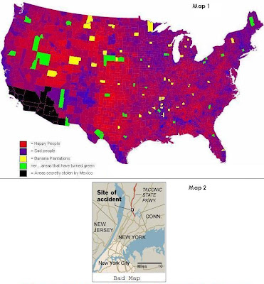
I consider these two maps as bad maps because Map 1 at the top has inaccurate information and does not make sense. This bad map is a cluttered mess, confuses the reader and has a disorganized layout.
I found Map 2 on a news web site. That map shows an accident site. Not much on exactly where the accident site is. Is it the north bound side of the State Parkway, or is it the South bound side of the parkway? Or maybe it is not at all on the Taconic State Parkway. Your guess is as good as mine.


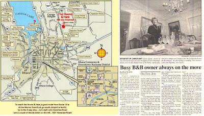
I found this map on a web page for a B&B Inn called Hound & Hare. I thought this map is a good map because it shows you where they are located with some directions just below the map. Also, the map shows you a more detailed view of the downtown area with the Cornell University, Ithaca College, Cayuga Lake and Shopping Centers. They mention on the site that there are also marvelous concerts, theaters and restaurants near bay as well. I found it fascinating so I included an article with some history of the place.
Professor Samuel Boothroyd built this magnificent white brick Colonial Style house in 1829 on a Military Tract given to my family by George Washington for service in the Revolutionary War. Explore the splendid herb gardens, fragrant rose beds and visit the old fashion lily pond and fountain! Surrounded by giant pines and expansive lawns, peace abounds for all who enter.

Sunday, January 10, 2010

Hello everyone! My name is Bobbee Hively. I am here in this class to further my career in photogrametry and GIS. I am currently working in the field of GIS. I am working with ArcMap editing/digitizing maps. My main career is in PRS (Photogrametry, and Remote Sensing) but I am also getting in more GIS as well. I look forward to chating with some of you this semester. If anyone has a question about arcmap I might be able to answer. I am fairly new with the software myself but I am learning more each day at work.

Thanks,

Bobbee